


Tepe Home · Web
Tepe Home Website
A new web experience that strengthens the premium brand, improves the user experience and supports the purchase decision.
- Client
- Tepe Home
- Platform
- Web
- Scope
- UX, UI, E-commerce, Design system, Responsive design

The challenge
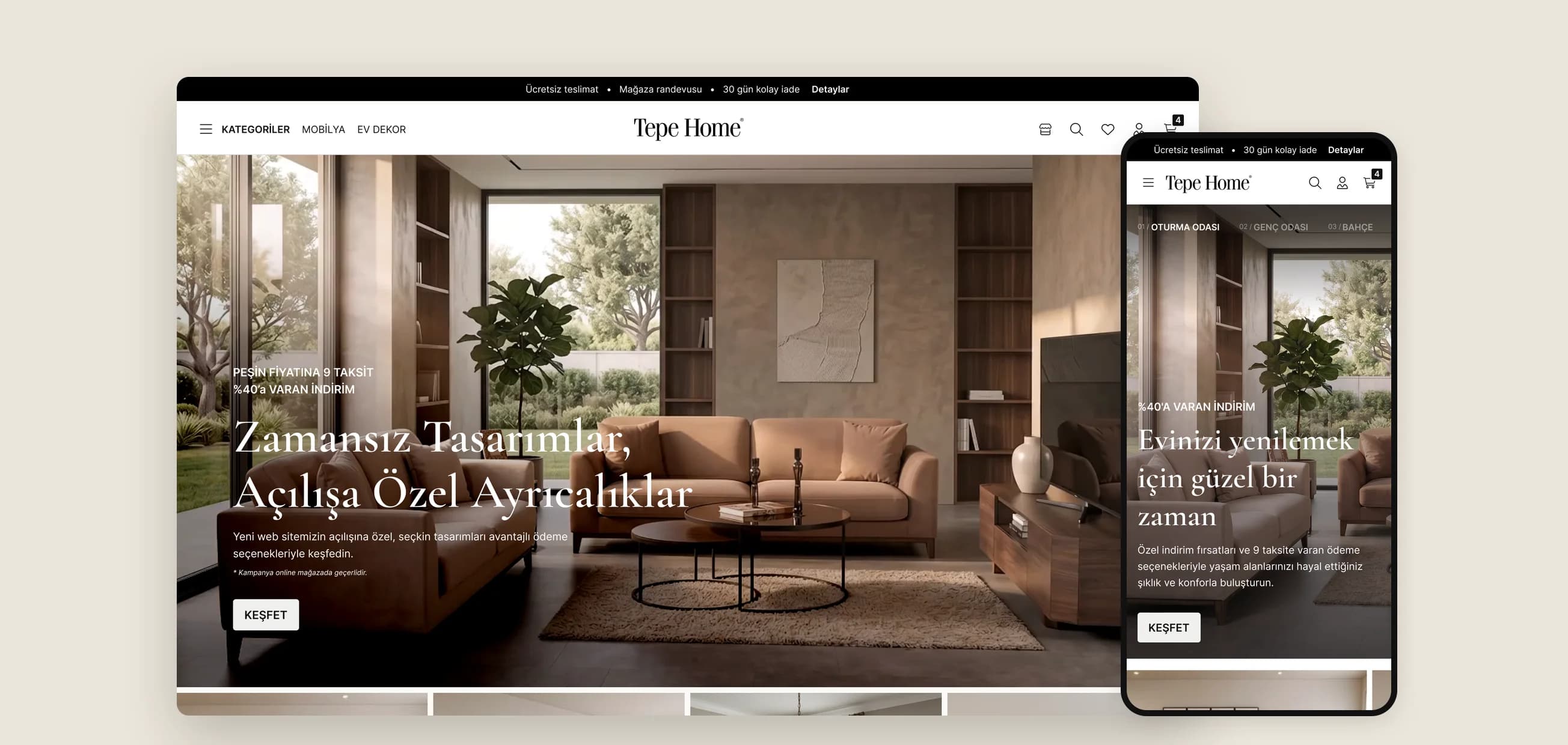
Tepe Home doesn't just list products: it helps people build their living spaces, and that takes inspiration, trust and easy decisions. The old site behaved like a campaign board instead. The hero, promo strip, category bar and product blocks all spoke at once, and visitors felt sales pressure rather than a confident brand. Category pages had many products but few filters, product pages didn't build enough trust and the basket was full of distractions.
Positioning
We placed the brand at accessible premium: between promotion-driven retailers and out-of-reach luxury names. The premium feel comes from taking noise away, not adding more: one strong image or video to set the mood, typography that never upstages the product, restrained commercial messages and white space that helps people decide.
Five steps
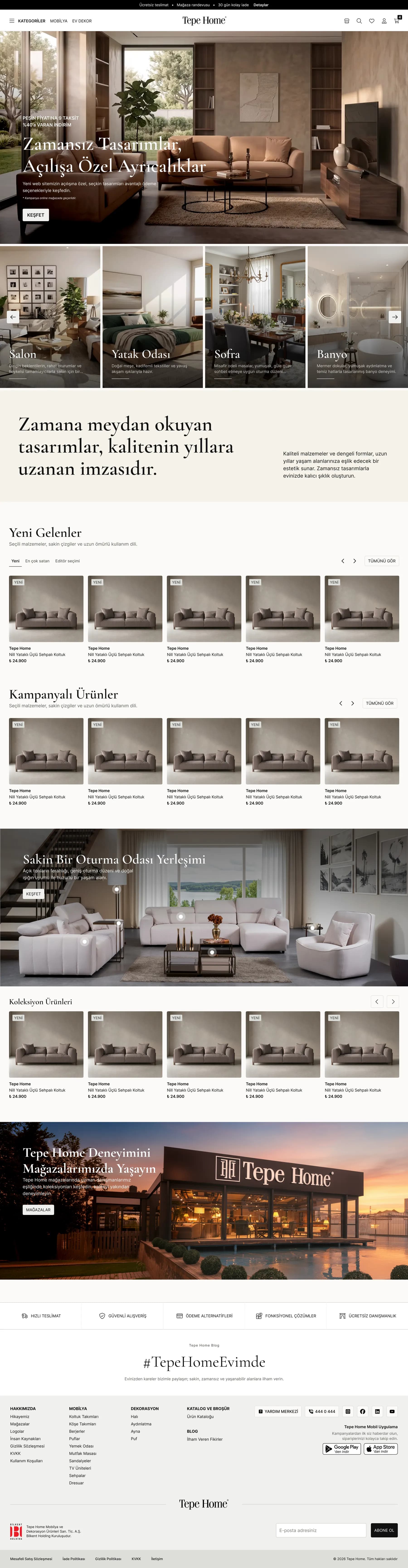
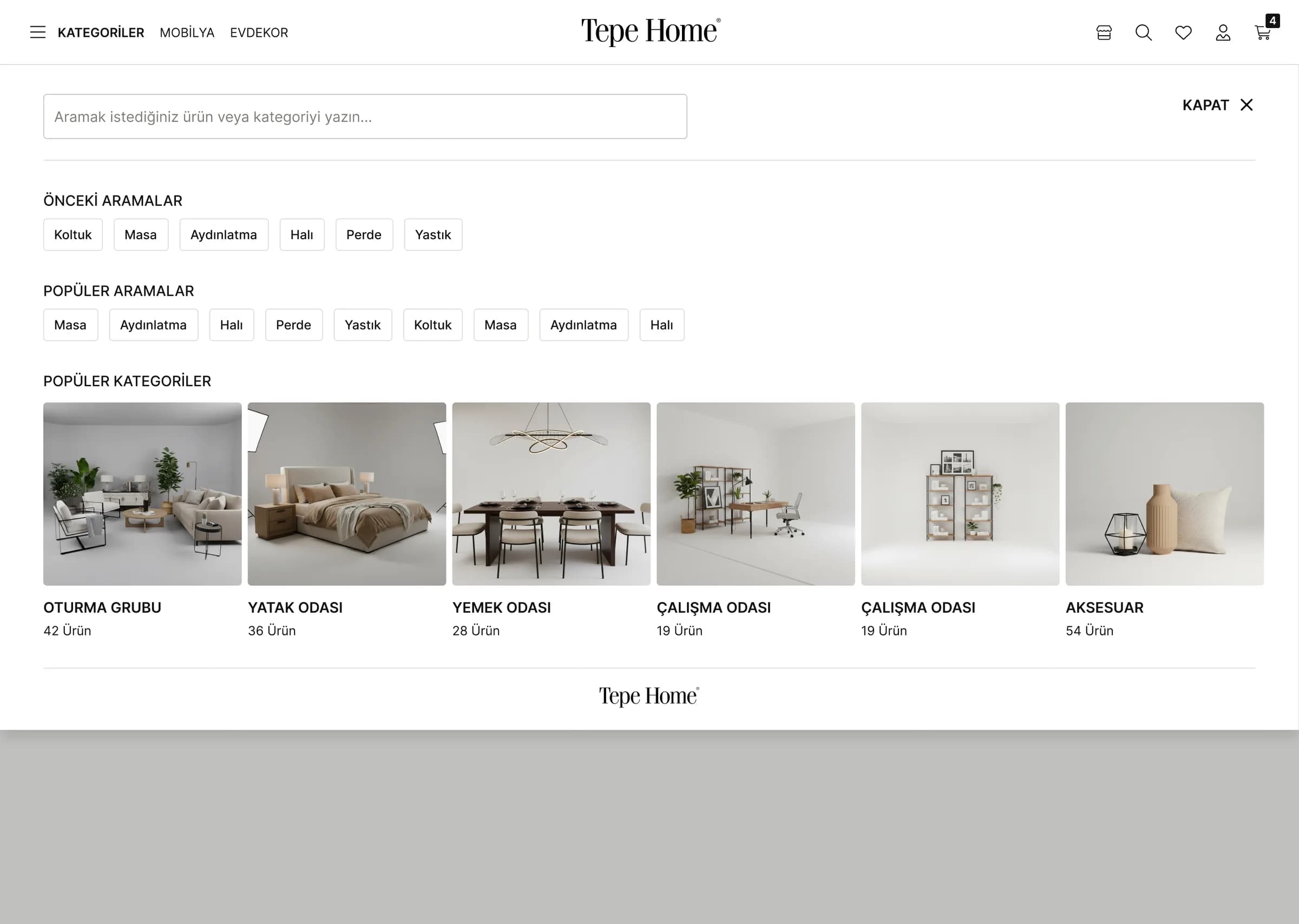
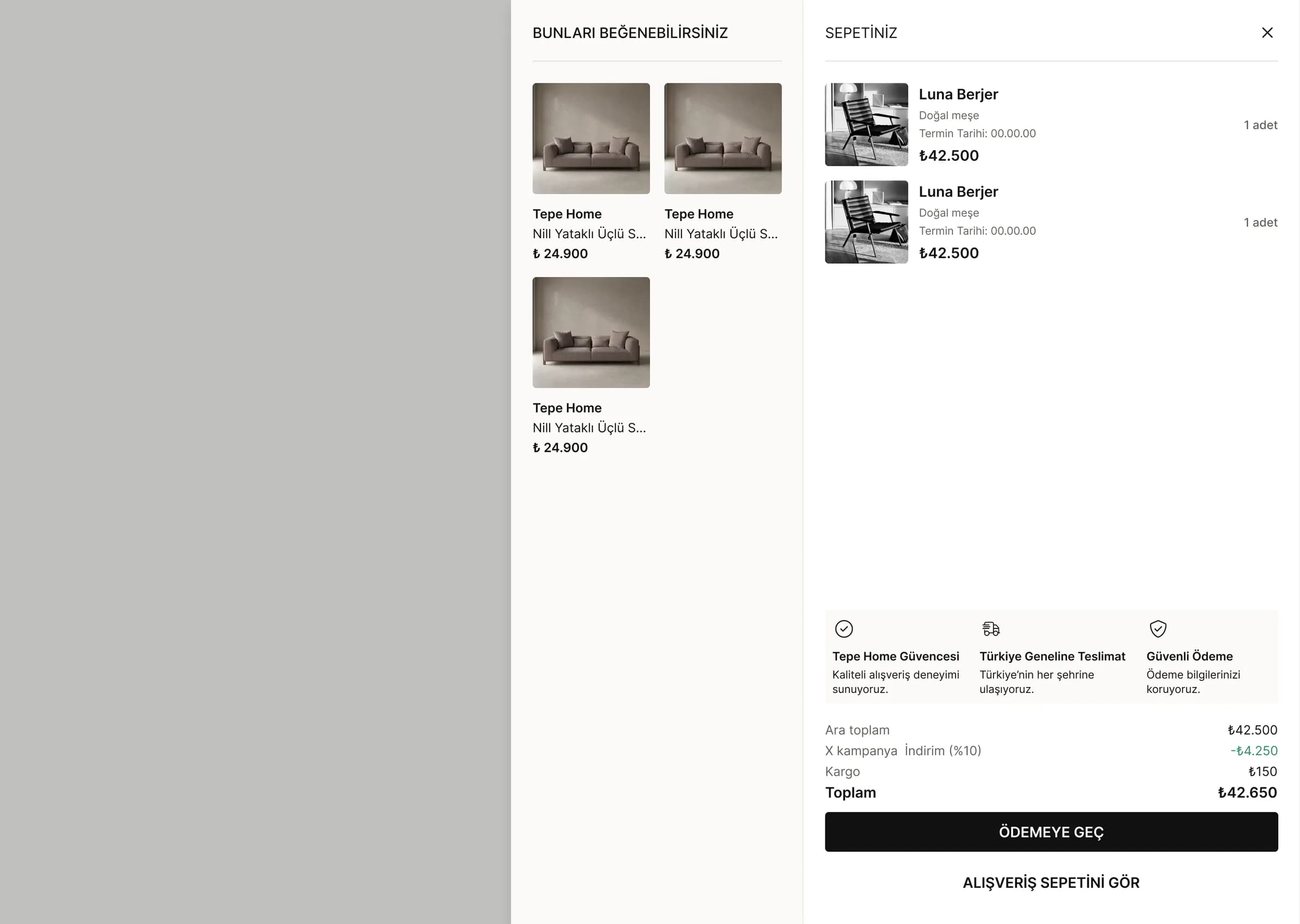
The first screen conveys the brand's way of living. The story then carries through to the products, with complementary pieces shown in a real room. Category pages make choosing easier with sorting, filters and product cards that show size, material and delivery. Product detail, basket and checkout remove every uncertainty on the way to payment.
Mobile web
Most people meet the brand on their phone, so discovery, product research and checkout are designed to be as strong on mobile as on desktop: the same typography and imagery, menus made for one hand and a simple basket flow.
69.25%
of web traffic in Türkiye comes from phones and tablets (StatCounter, May 2026)
4
key flows redesigned: home, category, product detail and basket
5
steps from first impression to checkout
Website
More projects
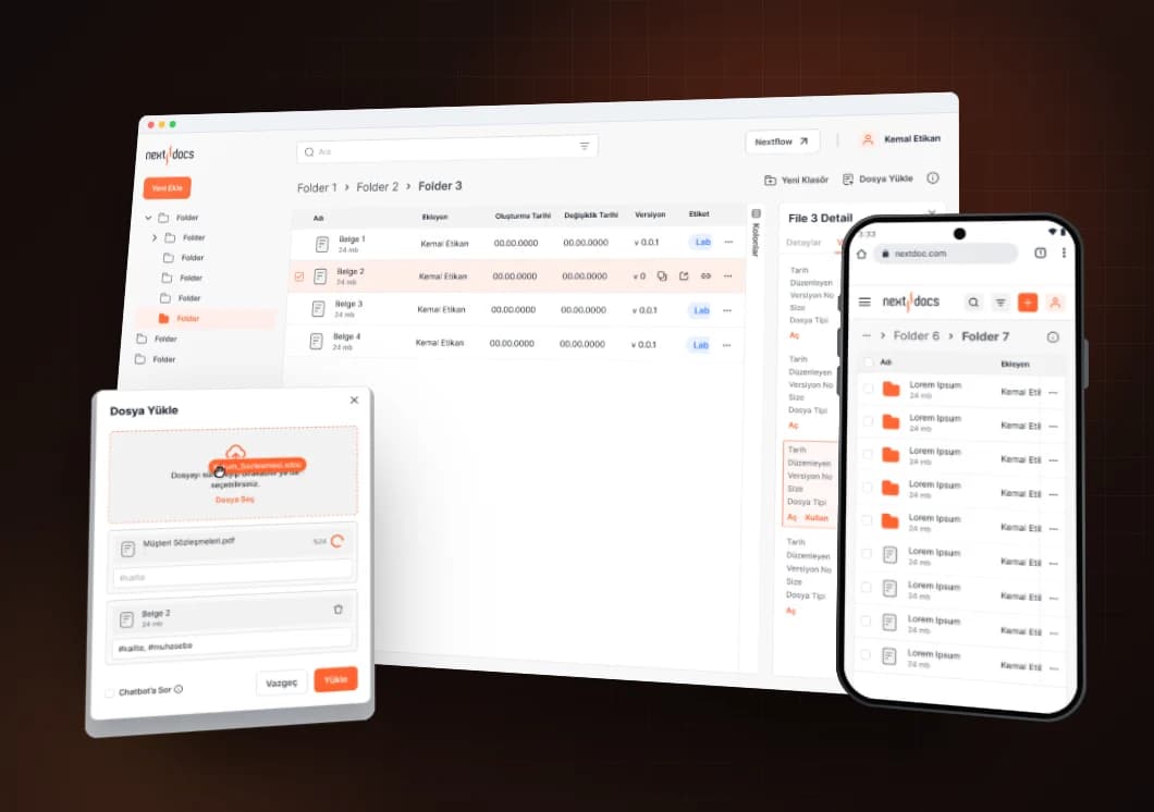
Eczacıbaşı Bilişim · Web
Next Docs
A document management system and UI kit for Eczacıbaşı Bilişim.
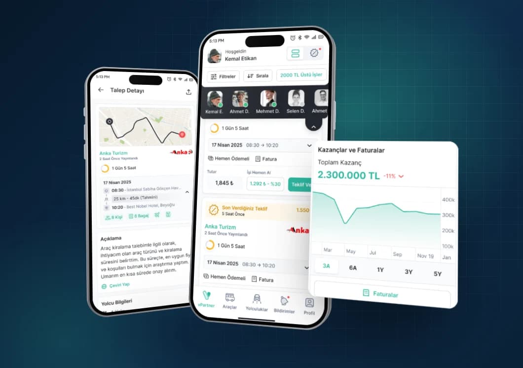
Vita Partner · Mobile
Vita Partner
A mobile app where transport suppliers manage their vehicles, drivers, trips and earnings.

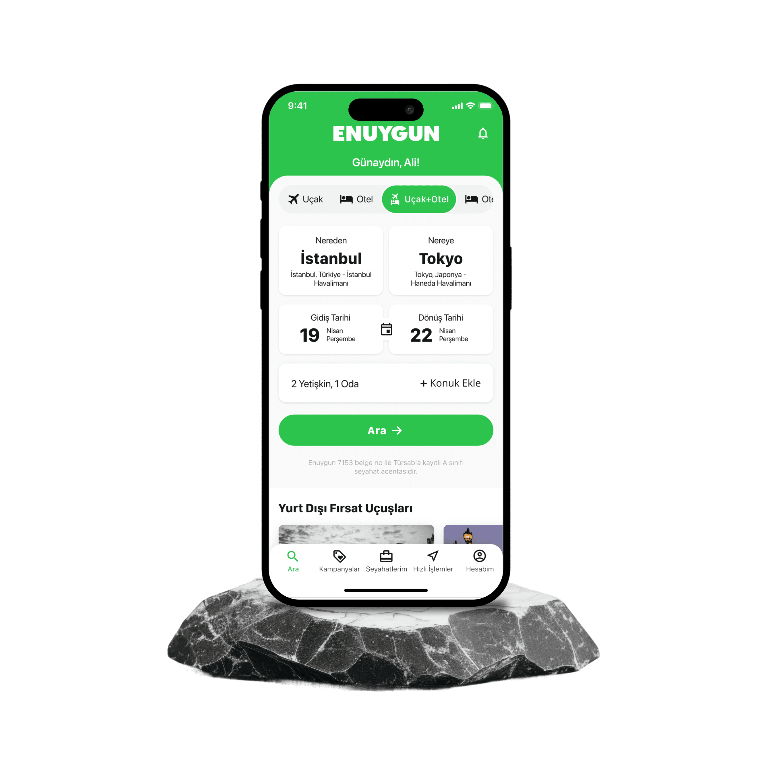
Enuygun · Mobile
Enuygun App
Enuygun is a user-friendly travel platform that simplifies the process of searching for and purchasing flight tickets.